Going beyond standard reports can take you to a new level of insight and capability. Creating your own fleet management reports in MyGeotab is really simple. This post gives you a step-by-step tutorial designing and importing your own MyGeotab custom dashboard report.
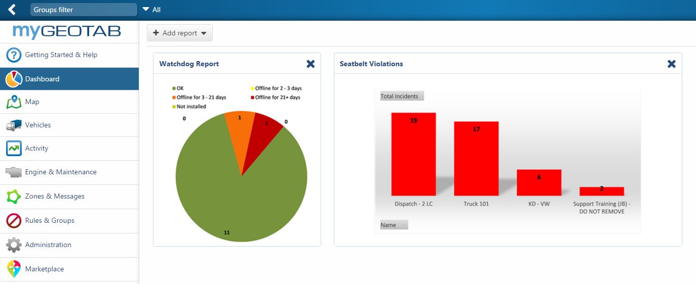
The Dashboard section of MyGeotab is the front page of your fleet management portal. You can pull any data from your portal on demand. However, putting the important metrics in one central location is a great way to save time and makes your job easier.
There are four easy steps to creating a new dashboard report:
- Determine what you want to measure.
- Export the exceptions report into MS Excel.
- Create an Excel chart.
- Import your Excel file into MyGeotab.
Follow the instructions in this post, and you will have the process mastered.
Designing a MyGeotab Custom Report
Step 1: Determine What You Want to Measure
The first thing you will want to establish is exactly what you want to measure. This will be determined by your company goals. There are many different things you could target, such as:
- Count the number of times a particular rule was broken.
- See how many miles the fleet drives every day.
- Determine the maximum speed.
- Set up a driver scorecard.
- Evaluate the fleet’s risk level.
- Top Seat Belt Offenders.
In this example, we’ll start with something simple: looking at the top seat belt offenders.
Step 2: Export the Exceptions Report into MS Excel
For this report, we’ll start by exporting an exceptions report into Microsoft Excel. In your MyGeotab database, go to Rules & Groups, and click Exceptions. Under Options, select your date range, your vehicles, your rule (in our case: Seat belt), then click the Apply changes button.
Custom reports only allow a maximum of 1000 rows in Excel, so select a number of vehicles or a date range that does not exceed this limit.

You will see a list of exceptions. To export your file, click View, select Summary, click Report. Click on the green Excel icon and the file will download to your computer.

Step 3: Create an Excel Chart
Open the downloaded Excel file. Check to ensure that you are on the Summary tab. The Summary tab contains a PivotTable that we will use to build our MyGeotab Dashboard report.
Click on the PivotTable. The PivotTable Fields box will appear on the right side of the screen, as shown below.

Let’s refine the view to show the count of seat belt violations. Go ahead and uncheck the field boxes, leaving only Name and Incident Count checked. The PivotTable will update automatically.
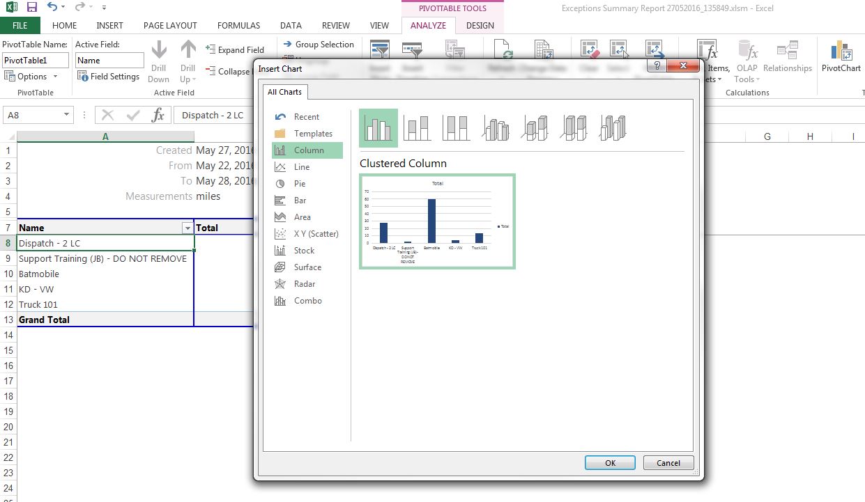
Click on the PivotTable again. On the Excel toolbar, under PivotTable Tools, click Analyze, then PivotChart.

From the options provided, select the type of chart you would like to display on your Dashboard (column, pie chart, bar graph, etc.). In this example, I have decided to use the default Clustered Column. Click the OK button. The PivotChart is inserted into the Excel report.
You can go ahead and import this new Dashboard report into your database. If you want to stop at this point, save your file in Excel in either an .xlsx or .xlsm format and jump ahead to Step #.
Optional: Format Your Excel Chart
At this stage, I prefer to make a few formatting changes. This requires only a few minutes and will make your chart more user-friendly and visually appealing.
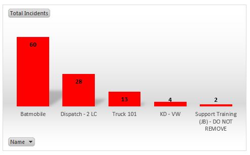
- Simplify the table by removing the extra boxes. This is easy to do. Just right-click and delete the Total boxes in the chart.
- I also like to sort the data so it displays from left to right, starting with the highest number of incidents. Find the Name box in the PivotTable, then click the small dropdown arrow in the right side of the cell. Select More Sort Options. Now, click Descending (Z to A) by: and select Total Incidents. Click OK. Our PivotChart is now sorted by our top seat belt offenders.
- If you have a large fleet, you may only want to display the Top 10 or 20 vehicles in the category. To do this, click the drop-down arrow in the Name cell, then select Value Filters and Top 10. Input your value and click OK.
- Click on the PivotChart, then, under PivotChart Tools, click Design. Mouse over the Chart Styles to preview, or click to select and change your chart. You can even change the colour of the chart by right-clicking on one of the columns.
- Save your file in Excel in either an .xlsx or .xlsm format. We now have our completed Dashboard report and are ready to bring it back into our database.
Step 4: Import your Excel file into MyGeotab
In your database, go to Administration > Reports & Report Views, then click Add Excel File. Drag and drop your file onto MyGeotab, or click to browse and select the file from your computer.

Once the file is loaded, you can modify the report settings.
- Report view tab — Switch the toggle for “Show report in drop-down list” to On.
- Dashboard tab — Switch the toggle for “Dashboard graphic options” to On. If you want the report to display on your own Dashboard, set “Display on my dashboard” to On as well. Under Dashboard viewers, you have to choose whether you wish to add this report to the dashboards of all company users or only for users in a certain group/s.
- Select your Date range, Refresh period, and Next run. I want this to run as a weekly report, so I want the date range to be “Last week”, my refresh period to “Weekly,” and my next run to be this coming Monday morning. The report will continue to automatically refresh every Monday morning at the same time.
- The report will show all vehicles in the fleet by default. If you want this report to display data only for a specific group of vehicles, specify that using the “Belonging to” dropdown.
- Under Additional Report options, click in the Exception rules box and select the Seat belt rule.
- Finally, scroll up to the top and rename your report, for example “Seatbelt Violations.” Click Save.
Your new custom report is now available for viewing on your Dashboard!
Dashboard reports are very powerful tools that can be used to observe fuel economy, stops, complicated scorecards, and much more! Combining the rules feature with reporting helps fleet managers measure performance in core areas, including productivity, safety, fleet optimisation, and compliance.
Using the steps outlined above, you should now be equipped to create your own beautiful, easy to understand dashboard reports in MyGeotab.
Author: Ben Pawlowski, Customer Experience Specialist, Fleet Division, Geotab USA
Download our industry-specific brochures:
Construction Vertical Brochure| Courier and Delivery Vertical Brochure | Field Sales & Services Vertical Brochure | Food and Beverage Vertical Brochure | Government Vertical Brochure | Mobility Transport Vertical Brochure | Oil Gas & Mining Vertical Brochure | Police and First Responder Vertical Brochure | Towing Vertical Brochure | Transportation and logistic Vertical Brochure | Utilities Vertical Brochure